26 September 2025
The 10 pillars of a product page that converts
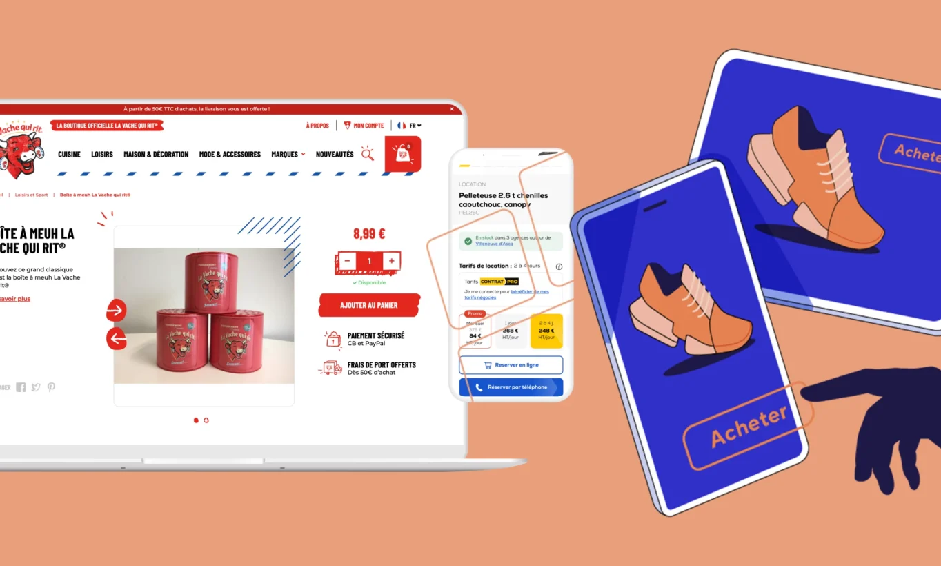
 What You’ll Learn in This Article
Before you scroll down, here’s a quick preview of what you’re about to discover:
- Why the Product Page Has Become the New E-Commerce Homepage
- How to Structure a Product Page That Meets the Needs of Both Google and Your Customers
- UX Best Practices for Improving the User Experience and Navigation
- The Importance of High-Quality Visuals and Rich Media
- How to Write Compelling, SEO-Optimized, and Customer-Centric Content
- The Impact of Customer Reviews, Social Proof, and Dynamic FAQs
- How to Reassure Users About Shipping, Returns, and Warranties
- The Art of Offering Product Variants and Smart Cross-Selling
- How to Incorporate Reassurance Elements That Build Trust
- Technical and Marketing Strategies to Turn Your Product Pages into a Powerful Conversion Tool
The product page—the new homepage?
For years, the home page was considered the main entry point for an e-commerce site. That’s where brands showcased their products, best-sellers, and promotional campaigns. It was the focal point for investments in UX, graphic design, and SEO. However, that central role has shifted. Today, users no longer necessarily enter a site through its homepage, but increasingly through a product page.
With the rise of long-tail SEO, Google Shopping, conversational search engines, and social commerce, the customer journey now begins directly on a product page. Users no longer search for “high-quality luggage sites,” but ratherfor “55cm expandable carry-on luggage” and land directly on the corresponding product page.
This trend is fundamentally changing the rules of the e-commerce game. The product page is no longer just a step in the conversion process, but the new strategic hub of the sales funnel. It is both:
- an SEO-ready landing page,
- a reinsurance vehicle,
- a branding hub,
- and an instant conversion interface.
On average, Product Detail Pages (PDPs) now account for more than 50% of inbound SEO traffic on major e-commerce sites (source: Verbolia).
However, many e-commerce merchants continue to view the product page as a simple descriptive page. This is a strategic mistake. The product page has evolved into a contextual, query-driven, and AI-compatible landing page. It must satisfy both Google and users—and, in the future, AI search engines (SearchGPT, Perplexity, AI Overviews, etc.).
The Sisley Paris brand is a prime example of how product pages have evolved into rich, well-structured, and informative pages. For several of its products, the brand has incorporated elements that offer significant added value:
- a dynamic, searchable FAQ section, directly embedded in the page,
- real-time delivery information, including via Chronopost,
- a detailed presentation of the compositions with specific visuals,
- usage-oriented storytelling that puts the product’s benefits into context.
These choices reflect a strategy focused on SEO, user experience, and AI readiness. According to a ShopperApproved study, adding structured Q&A modules can boost SEO visibility by up to 35% and improve search engine rankings by up to 40%, while also increasing conversion rates by reducing pre-purchase objections.
1. The Structure of a Perfect E-Commerce Product Page
A successful e-commerce product page is a powerful driver of conversions. It’s often one of the most crucial pages on your site, and it may even be the main entry point for new visitors coming from Google Shopping or social media ads. Crafting a compelling product page is therefore essential to capture the user’s attention from the very first moment and convert them into a customer. Here, we break down the essential elements of a perfect product page and explain how they can showcase your offerings—all supported by real-world examples. (Here’s a tip: Start thinking now about what you could improve on your own product listings!)
2. A seamless user experience from the moment you arrive
As soon as a visitor lands on the page, they should know where they are and how to navigate easily. To achieve this, we make sure to:
- Clear navigation: A well-organized menu and a breadcrumb trail at the top of the page help users see where the product fits within the site’s hierarchy. This allows users to navigate back to higher-level categories with a single click if they wish, without ever feeling lost. This consistency in the user journey contributes both to user satisfaction and to your site’s search engine rankings (search engines favor a well-defined structure).
- A visible call to action: The “Add to Cart” or “Buy” button should be immediately noticeable, ideally placed above the fold and in a contrasting color. This is the central element for conversion, which must capture the user’s attention right from the start. Strategic placement of the CTA has a direct impact on the add-to-cart rate.
- A clean, uncluttered layout: Key information (product name, price, rating, availability) should be presented clearly, without visual clutter. Clearly defined sections (details, reviews, recommendations, FAQs, etc.) help users navigate the page and quickly find what they’re looking for. Think mobile-first: on smartphones, scrolling should remain comfortable, with buttons large enough to be tapped with a finger.
In short, even before focusing on the content itself, make sure the page’s overall usability makes navigation and purchasing easy and frictionless.
3. High-quality product images
In e-commerce, images take the place of touch: your product images must therefore make up for the fact that customers cannot see the item in person. Here are a few best practices:
- HD Photos and Multiple Angles: Provide high-quality images that show the product from multiple angles and in different usage contexts, if relevant. A zoom or magnifying glass effect will allow customers to examine the details. Effective visuals catch the eye and build buyer confidence.
- Various media: If possible, also include a product video or a 360° animation. For example, a short demonstration video can showcase the product’s features or how it’s used much better than a still photo. This helps users visualize themselves using the product.
- Consistency and Speed: Make sure all images follow the same style (lighting, neutral background, etc.) to create a cohesive and professional-looking page. Optimize image file sizes so they don’t slow down page load times—a crucial factor for both user experience and SEO.
Tip: Don’t hesitate to also display contextual or user-generated visuals (Instagram photos, staged shots). They enrich the page and serve as additional social proof. A visitor who is visually informed is more likely to place an order, because people shop with their eyes first.
4. Rich and informative content
Beyond the images, the text content of the product page must appeal to both customers and search engines. Here are the must-haves:
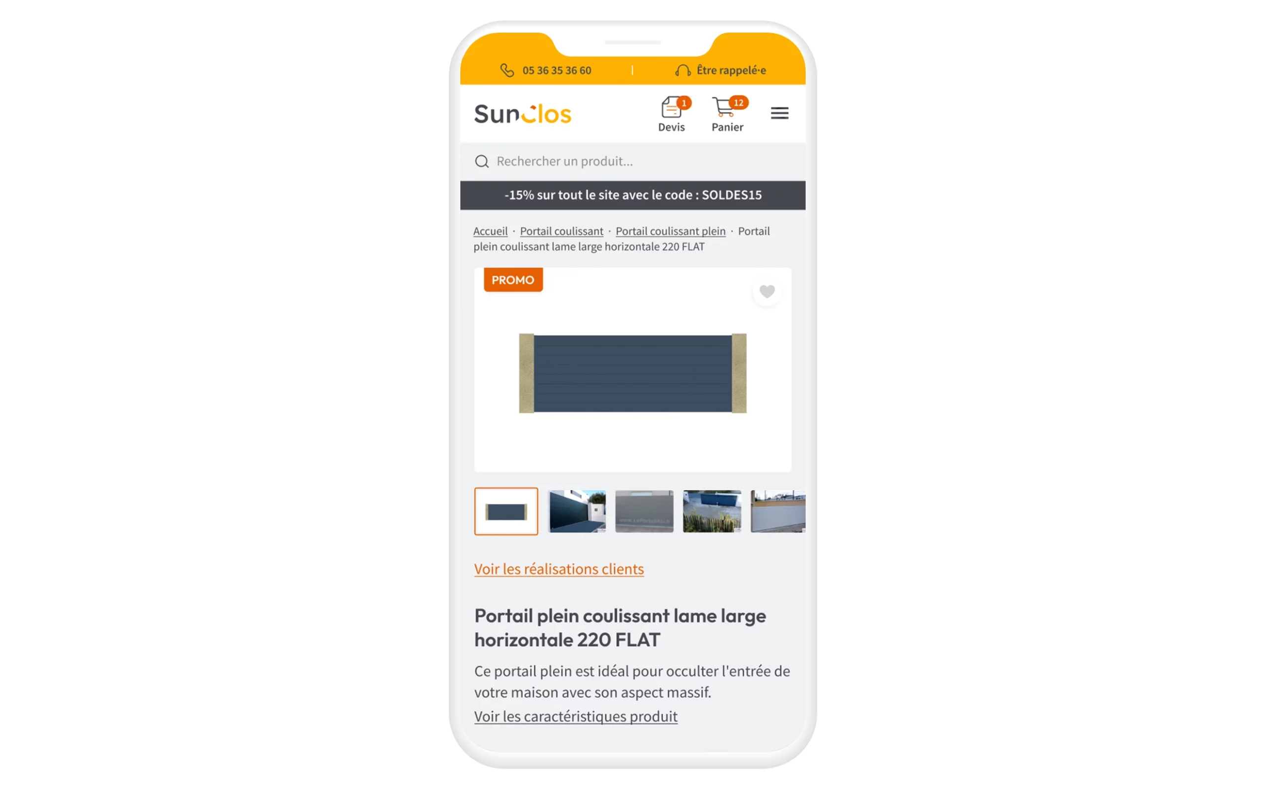
- A precise and catchy title: The product name (H1 tag) should be clear, descriptive, and may include the main keywords (useful for SEO). Feel free to add a standout product benefit or a key feature as a subtitle to grab attention.
- Comprehensive, customer-focused description: A detailed description highlights not only the technical specifications but, more importantly, the concrete benefits for the user. Write a description that tells the product’s story: what is it used for, what problem does it solve, and what makes it unique? This rich content also has the advantage of improving visibility for long-tail search queries in SEO. The more polished your description is, the more you’ll stand out from competitors with generic product listings, and the more you’ll reassure buyers of your expertise.
- Technical Specifications and Features: In addition to the descriptive text, clearly list the technical specifications (dimensions, weight, materials, composition, compatibility, etc.). This structured list allows even the most discerning visitors to quickly verify a specific detail. Furthermore, including as many specific details as possible helps you target niche SEO keywords and answer the detailed questions your customers may have.
- Warnings or usage tips: Depending on the product, it may be helpful to include tips (e.g., size guides for clothing, care instructions, safety precautions, etc.). This practical information adds value and shows that you’re there to support the customer even after the purchase.
In summary, a perfect product page strikes the right balance between marketing and information. It appeals to customers with a benefits-focused message while providing all the relevant information needed to inform their purchasing decision. Rich, unique content with high added value benefits both your customer (who makes an informed purchase) and your organic search rankings on Google.

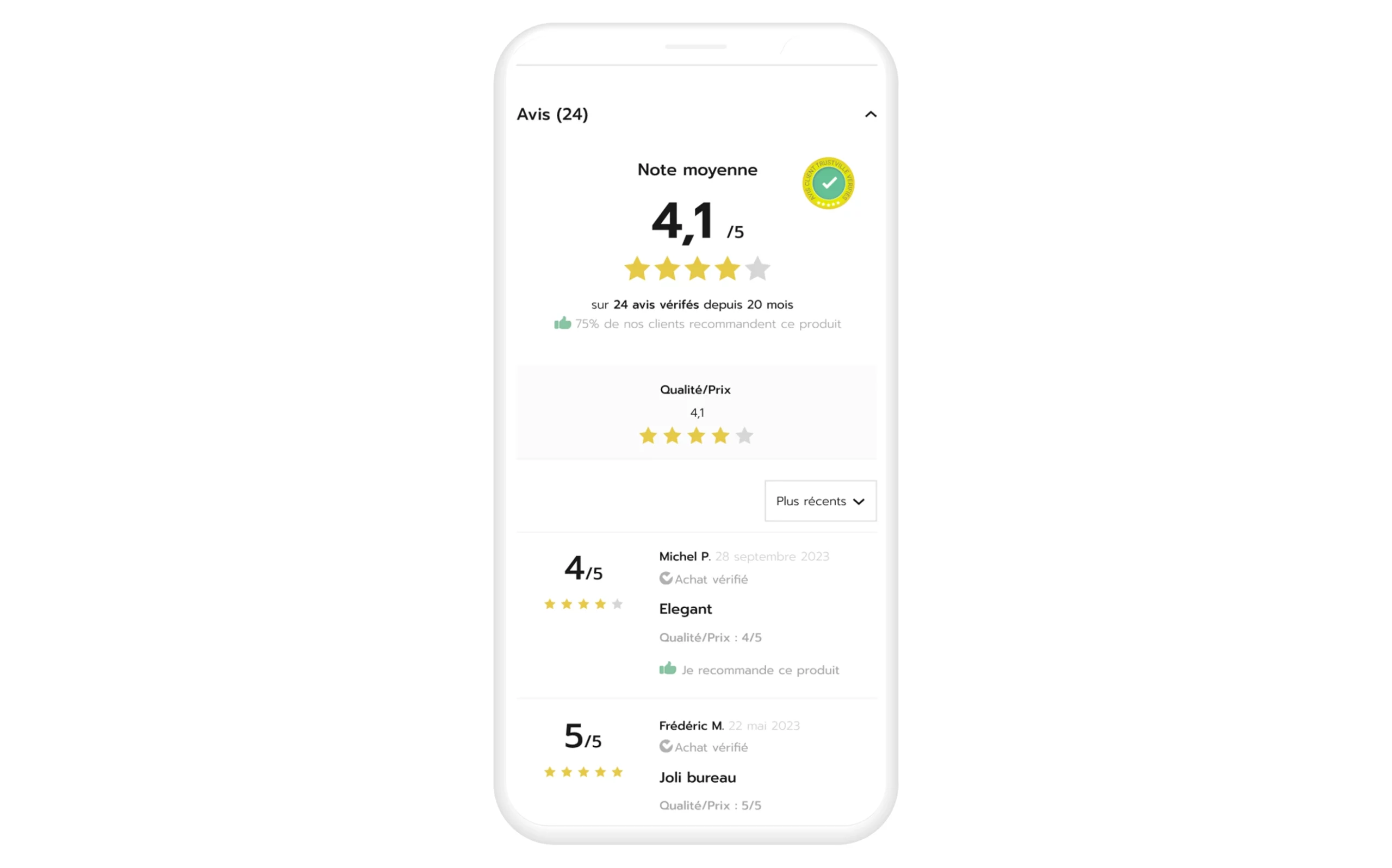
5. Customer Reviews and Social Proof
According to a Spiegel study, 95% of consumers read online reviews before making a purchase. Including feedback from your previous customers on the product page has therefore become essential for several reasons:
- Building trust: Seeing that other buyers have given the product positive reviews reassures the prospect about its quality. Reviews serve as social proof and help dispel doubts (“Is this backpack really durable?”). Even mixed reviews can be helpful if they’re constructive, as they provide transparency.
- Provide additional information: Customers often mention details in their reviews that aren’t included in the product description (ease of use, compatibility, tips for use, etc.). This information supplements the product listing and can answer questions that other visitors may have.
- Encourage engagement: An active reviews section encourages visitors to spend more time on the page and even ask their own questions. It provides an opportunity for interaction (for example, through customer support responses to reviews), which humanizes your site and fosters a dialogue based on trust.
To maximize the impact of reviews, display the average rating and the number of reviews at the top of the product page (below the product title)—so visitors see them right away. Further down, include a dedicated section featuring all the reviews and testimonials. If the list is long, a compact (collapsed) view is recommended so as not to overwhelm the page while still allowing users to read everything.
Finally, be sure to include other forms of social proof on the product page: award or quality badges, certification logos, “Best-seller” labels, or press accolades (“Voted Product of the Year,” etc.). These visual elements boost your page’s credibility. In the same vein, clearly display your commitments (made in France, eco-friendly, limited edition supported by a community, etc.) that can make a difference in the eyes of the customer. Remember, online, visitor trust is paramount: any credible indicator that fosters it can tip the scales in your favor.
6. Frequently Asked Questions (FAQ) for Addressing Objections
Even with a detailed description, shoppers may still have specific questions before adding an item to their cart. That’s where the FAQ on the product page comes in. The largest e-commerce sites consistently include an FAQ section directly on the product page. Why is this Q&A module so valuable?
- It clears up common doubts: By compiling frequently asked questions from customers (about size, usage, compatibility, warranty, etc.), you prevent visitors from leaving the page to look for the information elsewhere. A well-crafted FAQ can thus turn a hesitant visitor into a buyer by immediately providing the answer they need to feel reassured.
- It improves the user experience: Often presented as drop-down questions (dynamic accordions), the FAQ allows you to provide a lot of information without making the page look cluttered. Users click only on the questions that interest them, keeping the rest of the page clean and uncluttered.
- It lightens the load on customer service: By addressing common questions in advance (delivery, returns, compatibility, etc.), you reduce the number of inquiries to customer service. It’s a win-win: the customer gets an immediate answer, and you receive fewer emails or calls about basic inquiries.
- It enhances SEO content: Each question-and-answer pair is an opportunity to include relevant keywords and fresh content. For example, a question such as “Is this product compatible with a certain accessory?” followed by a detailed answer adds useful, indexable text for search engines. Google values this type of FAQ content, which often matches users’ natural-language search queries.
Specifically, a product FAQ can cover topics such as usage, maintenance, differences between models, or any common concerns that might deter a purchase.
Example: On the product page for a Delsey carry-on suitcase, a very comprehensive “Frequently Asked Questions” section provides information on the permitted dimensions for air travel, the difference between carry-on luggage and a handbag, how to measure luggage, and more. This level of detail demonstrates a genuine commitment to customer service and helps eliminate a lot of uncertainty for the customer.
Good to know: Some companies incorporate dynamic FAQs linked to a knowledge base or online support system. This allows the FAQ to update automatically based on customer feedback or product updates. In any case, don’t forget to keep these questions and answers up to date and to add any new questions you encounter—a dynamic FAQ is a sign of a brand that listens to its customers.
7. Clear shipping information and returns with no surprises
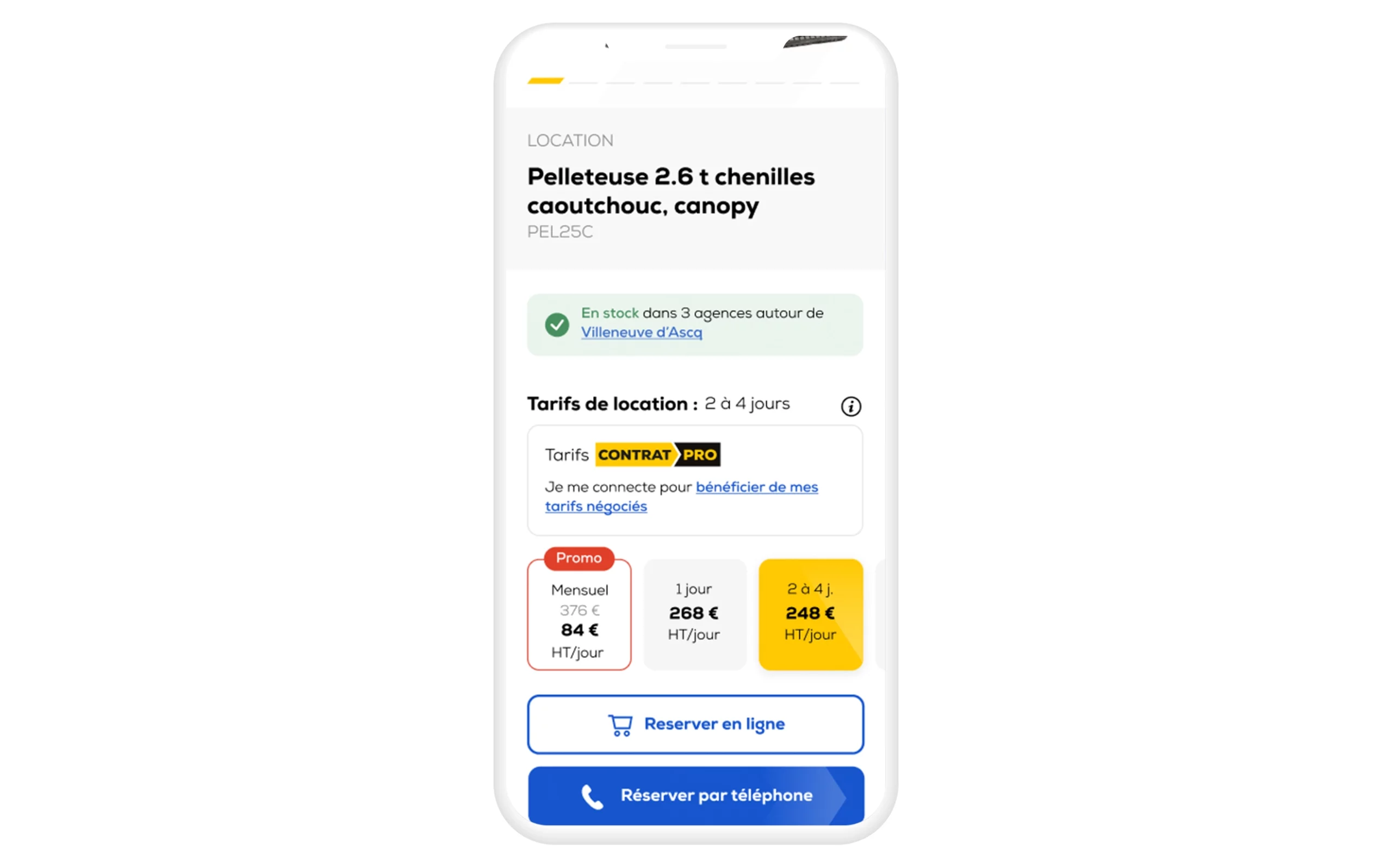
Delivery and return policies are among the most important pieces of information for shoppers. If there’s one place where this information should be clearly displayed, it’s on the product page itself. Don’t force your visitors to scour the site to find shipping costs or delivery times once they’ve made their purchase decision: not only would the user experience suffer, but search engines might penalize you if this information isn’t easily accessible on the page.
Here’s how to excel in this area:
- Highlight shipping costs and options: Clearly state the available shipping methods, their costs, and, if applicable, the minimum purchase amount for free shipping. For example, Delsey states right on the product page that standard home delivery (2 to 5 days) costs €9.90 and is free for purchases of €99 or more. This type of information should be easily visible, often near the price or in a dedicated “Shipping & Returns” section.
- Transparent estimated delivery times: Specify the estimated delivery times for each shipping method (standard, express, etc.). Better yet, some websites are innovating by displaying an estimated delivery date calculated in real time. For example, you can state , “Order by 3 p.m. today for estimated delivery on August 5 via Chronopost.” This level of precision, made possible by integrating carrier APIs, greatly reassures customers about when they’ll receive their order. The promise of receiving the product quickly is a strong incentive to buy.
- Return Policy Displayed: Clearly state the conditions for returns or exchanges: timeframe (14 days, 30 days…), required product condition, any return fees, etc. The customer needs to know what to expect in case of a problem, even before placing an order. Here again, Delsey sets an example with a box that reads, “Returns: You have 14 days… to return your item,” right on the product page. This transparency prevents unpleasant surprises and builds trust.
By centralizing this key information in the right place, you can answer essential logistical questions without interrupting the shopping experience. This is appreciated by customers (no one likes to find out at the last minute that shipping is expensive or slow) and benefits your organic search rankings, since Google prioritizes content that enhances user satisfaction.
8. Customization Options and Variant Selection
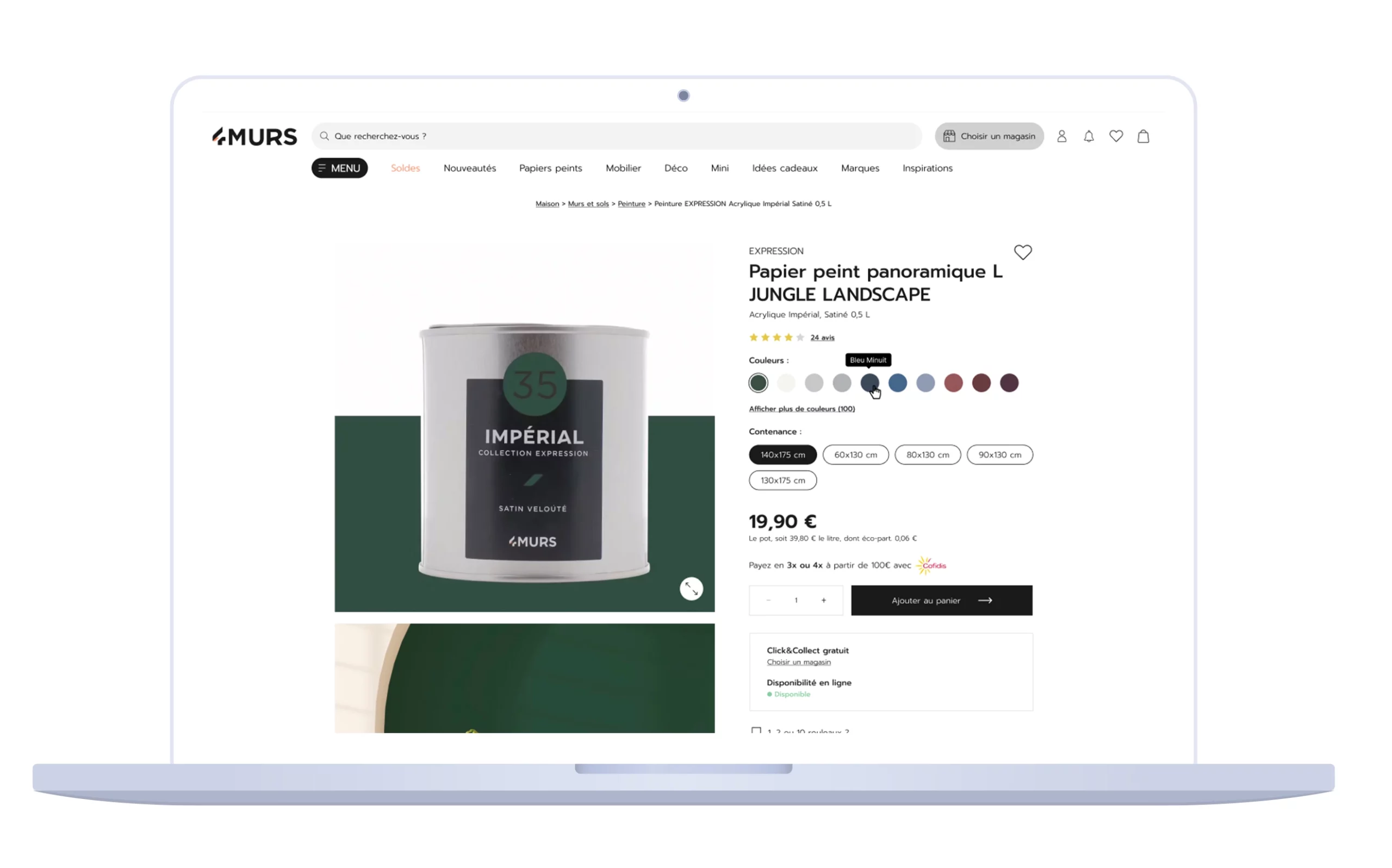
A product often comes in several variations: sizes, colors, related models, etc. An optimal product page should present all available options in a clear and interactive way. Objectives: to help the buyer find the version that suits them best, and to keep them on the same page as they navigate among these options.
- Ergonomic variant selector: Include buttons or thumbnails that allow customers to choose, for example, the color or size with a single click. Each option should instantly update the image and product details (without reloading the entire page, if possible). For example, for a piece of clothing, color swatches or thumbnail photos show each color option. This allows the user to immediately see what the product looks like in the selected variant.
- Real-time availability: Indicate the availability (in stock, out of stock) for each variant. Nothing is more frustrating than choosing a size only to find out it’s unavailable when you try to add it to your cart. If an option is out of stock, the product page should clearly indicate this (perhaps by graying out the corresponding button) and offer a restock alert.
- Related and Compatible Products: If your product requires accessories or has complementary products (e.g., a smartphone and its case, a vacuum cleaner and its bags, etc.), be sure to list them as well. You can do this either through a “Compatible Products” section or by directly suggesting that customers add these options from the page (bundle). This makes life easier for customers, who can add everything at once, and increases your average order value.
Effective variant management ensures that your product page covers the entire range of related offerings. The customer doesn’t need to look elsewhere—everything is right there, presented in an organized manner. This helps you avoid losing the customer along the way. Better yet, by making it easier to compare different versions (colors, sizes, etc.), you help them make the right choice, thereby reducing the risk of product returns due to selection errors.
9. Recommendations for Increasing the Average Order Value
When a visitor browses a product page, that product isn’t always the only one that might interest them. That’s why product pages on successful e-commerce sites almost always feature recommendations for related products. These recommendations serve two key purposes: keeping the visitor on the site longer and maximizing the value of their order.
There are several complementary approaches:
- Similar Products: Display related or alternative items (e.g., a model from the same product line or a substitute product). The goal is to keep the potential buyer engaged even if they aren’t convinced by the original product. Amazon excels at this by offering “Items similar to the one you’re viewing.” This way, if Product A doesn’t appeal to the customer, they’ll click on Product B rather than leaving the site.
- Complementary products: This is the well-known technique of cross-selling. On a camera product page, you might suggest a lens, a camera bag, or a memory card. On a suitcase product page, for example, Delsey offers matching travel accessories. This section is often introduced by a heading such as “You might also like…” or “Complete your look/outfit with…”. When placed effectively, it encourages customers to add other relevant items to their cart.
- User-Based Personalization: If you have data on the visitor (browsing history, previous purchases), you can take it a step further with personalized, real-time recommendations. These might include recently viewed products, “Customers who bought this item also bought…,” or items specifically selected for that user ’s profile. These personalization algorithms, based on AI or business rules, help drive product discovery and boost your upselling.
Be sure to integrate these blocks of recommendations consistently into the layout (usually at the bottom of the page, or in a sidebar on desktop). They should catch the eye without completely diverting attention from the main product. Ideally, a visitor scrolling down should naturally come across these suggestions once they’ve reviewed the main information.
Finally, don’t forget to measure the impact of these recommendations using your analytics tools: click-through rate, added to cart, and conversion. This will allow you to refine their relevance over time (for example, by testing different headlines or types of recommendations). When used effectively, product suggestions play a significant role in increasing the average cart value and helping customers discover your catalog.
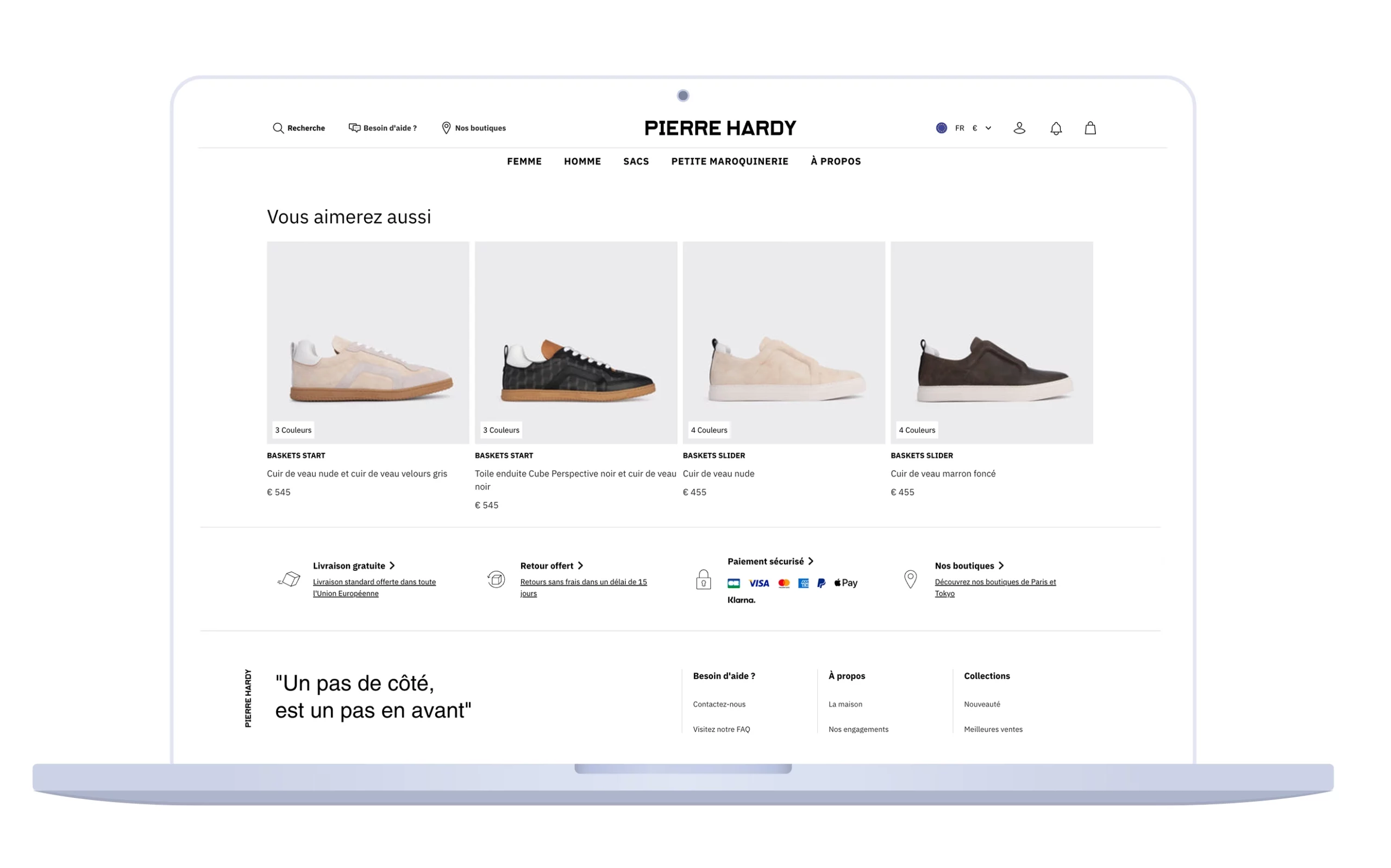
10. Guarantees, Payment, and Other Reinsurance Provisions
For a visitor to become a confident buyer, the product page must eliminate any remaining psychological barriers. Beyond the aspects already mentioned (reviews, FAQs, shipping, returns), certain additional reassurances can make all the difference when it comes time to click “Buy”:
- Security and Warranty Badges: Clearly display secure payment icons (SSL encryption, Visa/MasterCard/PayPal logos, etc.), as well as any commercial warranties you offer. For example, Delsey notes on its product pages that payment is 100% secure and that its suitcases are covered by a warranty ranging from 2 to 10 years. These assurances of reliability help alleviate concerns about financial risk or product durability.
- Third-party trust badges: Depending on your industry, badges such as “Trusted Shops,” “Verified Reviews,” “Google Customer Reviews,” or awards (“Best E-commerce Retailer of the Year”) can be highlighted. This lends credibility to your site in the eyes of a new visitor who isn’t yet familiar with you.
- Clarity on payment methods: Specify the accepted payment methods (credit cards, PayPal, and any installment payment options). Offering multiple options is a plus, especially if you provide credit or installment payment plans for high-priced items. Customers shouldn’t have to guess how they can pay—everything should be clearly stated at the bottom of the page or in the footer.
- Customer Service and Support: Highlight that customer service is available to answer any questions. A simple message like “Have a question? Contact our support team 6 days a week” along with a phone number or a link to live chat may be enough. The key is to show users that you’ll be there to help them if they need it. Some product pages even include a small box that says, “Your expert: Have a question about this product?” inviting users to ask a question in real time—a proactive approach that can quickly clear up any lingering doubts.
- Simplicity of the purchasing process: Finally, reassure the user that it’s easy to complete their order. For example, mention “Order in 3 clicks, ” “No account required, ” or “100% secure payment and ordering.” These aren’t strictly speaking part of the product page, but you can briefly highlight them in this strategic location, using icons or short text. The fewer potential roadblocks you highlight, the more likely the user will be to complete the purchase.
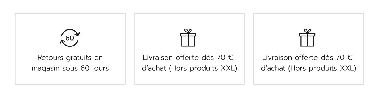
By combining these reassuring elements, you create a reassuring context around your product that builds the buyer’s confidence. On a suitcase product page, for example, seeing phrases like “5-Year Warranty, ” “Free Returns within 30 Days, ” “Secure Payment,” and “Responsive Customer Service” creates a positive atmosphere: the customer feels protected in case of a problem and supported by a reliable service. Don’t underestimate the impact of these details, which are often decisive in the conversion funnel.
DATASOLUTION and Jetpulp’s expertise in optimizing your product listings
Creating the perfect e-commerce product page requires multidisciplinary expertise. UX design, copywriting, SEO, web development… all these areas must come together to produce a page that is attractive, informative, and commercially effective.
At DATASOLUTION, we offer you all of this expertise to help you turn your product pages into sales drivers.
Our areas of expertise include, among others:
- Custom UX/UI Design: Analysis of your customer journey, layout optimization, mobile usability, and seamless integration of key elements (CTAs, visuals, navigation, etc.). We create product pages that deliver an exceptional user experience and maximize your conversions.
- High-Quality Writing & Content: Crafting compelling, SEO-optimized product descriptions; designing dynamic FAQs based on your customers’ questions; and highlighting your customer reviews and case studies. Rich, well-structured content boosts both your organic search rankings and your visitors’ trust.
- Integration of advanced e-commerce features: We implement the tools needed to enhance your product listings: customer review and rating modules, interactive FAQ systems, real-time display of inventory levels and estimated delivery dates (integration with carrier APIs such as Chronopost), personalized product suggestions via recommendation algorithms, and more. Your product page becomes smart and always up to date.
- Conversion Rate Optimization (CRO) and Web Analytics: A/B testing of your product pages, user behavior analysis, continuous improvement of the purchase funnel… Our CRO experts identify friction points and opportunities for improvement to continuously increase your conversion rate. Every element—from the color of a button to the placement of a section—is tested and optimized based on tangible data.
- Technical Performance and Technical SEO: Audit of your page load speed (Core Web Vitals), optimization of HTML markup (structured product data, title tags, meta descriptions), implementation of SEO-friendly breadcrumbs, etc. We ensure that your product pages are not only appealing to visitors but also exemplary in Google’s eyes.
Your online store deserves product listings that are on par with the best in the industry. If you want to take your business to the next level and offer your customers truly perfect product pages, contact us today to discuss your needs. Our experts will be happy to analyze your current pages and propose a customized action plan.
Please feel free to contact our teams
FAQ – Optimizing Your E-Commerce Product Listings
Because more and more users are arriving directly at a product page via Google (long-tail SEO), Google Shopping, social media, or AI-powered search engines. The home page is no longer always the main entry point.
An effective product page should combine high-quality visuals, a detailed, customer-focused description, accurate technical information, reviews and social proof, reassurances (delivery, returns, warranties), and clear calls to action.
You need to optimize the title (H1), meta tags, unique and detailed descriptions, structured data (schema.org), the embedded FAQ, and customer reviews. Incorporating long-tail keywords significantly improves visibility.
The FAQ helps address objections before a purchase, improves the user experience, and reduces the workload on customer service. In addition, it enriches the page with indexable content and improves SEO rankings for natural language search queries.
Cross-selling (complementary products), up-selling (premium versions), personalized recommendations, and bundles (product packages) are effective strategies for increasing the average order value.
By clearly displaying shipping and return policies, warranties, secure payment methods, as well as customer reviews and trust seals. Transparency reduces shopping cart abandonment.
Essential: HD photos from multiple angles, zoom, demonstration videos, 360° views, as well as user-generated content (UGC). Visuals make up for the lack of tactile experience and build trust.
Because an effective product page requires a range of skills: UX design, SEO copywriting, technical integration, CRO, and web analytics. DATASOLUTION’s expertise ensures a comprehensive, performance-driven approach.
Related articles
Visit the blog
ChatGPT Ads on Shopify and HubSpot: What This Means for E-commerce Businesses and Marketing Teams in France
02/10/2026
Fine-tuning LLMs in the Enterprise: Better Than a Frontier Model?
28/09/2026

OroMomentum: AI for B2B efficiency
22/09/2026

AI: The 5 Top Stories of Summer 2026
17/09/2026
Content management on Magento: how to give marketing teams back control with Hyvä CMS
17/08/2026